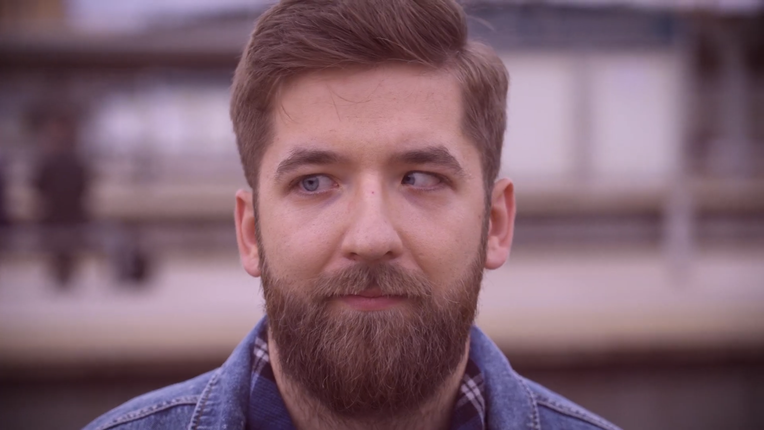
One Click Photo School is a landing page concept for a beginner photography course designed for people who want to take better photos without being overwhelmed by technical terminology. The project focuses on a calm, clear and accessible presentation of the course and its benefits.
One Click Photo School
2026
UX/UI Design · Landing Page · Visual Design · Figma


Beginner photographers often rely on automatic camera settings, want better-looking photos, but feel discouraged by technical terms and complex explanations. The goal was to present photography education as simple, understandable and achievable from the very first steps.
I structured the landing page around a clear learning promise and an easy-to-follow content hierarchy, defining the key sections, user flow and visual emphasis in Figma. The design uses simple language, strong visual hierarchy and a before-and-after narrative to communicate the course value to beginners.
The final Figma concept presents the course as an approachable learning experience focused on practical improvement: understanding light, composing a frame with more confidence and creating photographs that feel more intentional and visually refined.
This project helped me practice structuring educational content, simplifying complex information and building a clear visual hierarchy for a conversion-focused landing page.
One Click Photo School is a landing page concept for a beginner photography course designed for people who want to take better photos without being overwhelmed by technical terminology. The project focuses on a calm, clear and accessible presentation of the course and its benefits.
One Click Photo School
2026
UX/UI Design · Landing Page · Visual Design · Figma
Beginner photographers often rely on automatic camera settings, want better-looking photos, but feel discouraged by technical terms and complex explanations. The goal was to present photography education as simple, understandable and achievable from the very first steps.
I structured the landing page around a clear learning promise and an easy-to-follow content hierarchy, defining the key sections, user flow and visual emphasis in Figma. The design uses simple language, strong visual hierarchy and a before-and-after narrative to communicate the course value to beginners.
The final Figma concept presents the course as an approachable learning experience focused on practical improvement: understanding light, composing a frame with more confidence and creating photographs that feel more intentional and visually refined.
This project helped me practice structuring educational content, simplifying complex information and building a clear visual hierarchy for a conversion-focused landing page.